mirror of
https://github.com/gmemstr/blog.gabrielsimmer.com.git
synced 2024-09-19 19:51:10 +01:00
52 lines
2.9 KiB
Markdown
52 lines
2.9 KiB
Markdown
|
|
---
|
||
|
|
title: Let's talk about the Windows Taskbar
|
||
|
|
date: 2015-11-21
|
||
|
|
---
|
||
|
|
|
||
|
|
#### Or a small rant about why I hate the Windows (10) UI
|
||
|
|
|
||
|
|
Windows (insert version here) doesn't look good. I believe this is a very well established fact. OSX? That is a good interface. GNOME 3? It's okay. XFCE? Pretty sharp. So why can't Microsoft learn from them?
|
||
|
|
|
||
|
|
First off, Microsoft is stubborn. I've learned this very recently. They
|
||
|
|
haven't changed much of their UI design over the years, haven't really
|
||
|
|
rethought it. It's annoying, to say the least. Sure, they moved to
|
||
|
|
making sharper edges (pun intended). And sure, they trying their tiled
|
||
|
|
displays. But it's all garbage, compared to something like OSX's
|
||
|
|
fantastic UI.
|
||
|
|
|
||
|
|
|
||
|
|
|
||
|
|
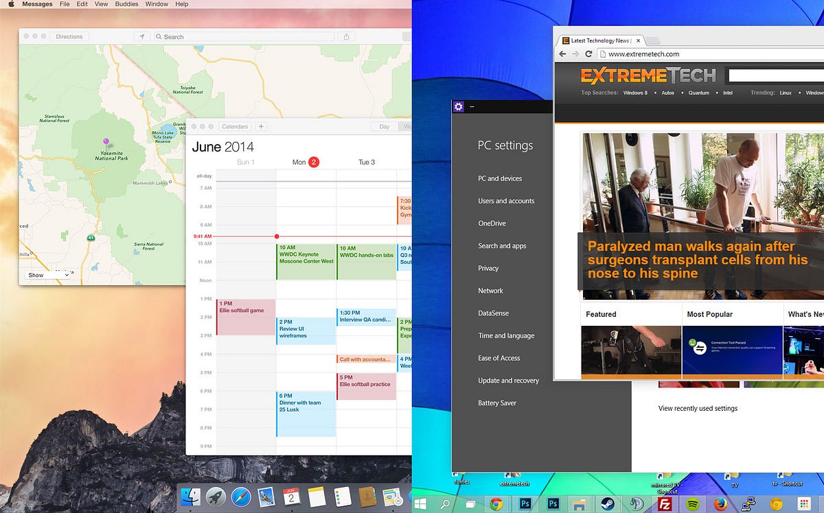
As you can see, OSX is *clean*. It's *soft.* It doesn't clutter up the
|
||
|
|
taskbar the way Windows does, it doesn't have massive top bars on
|
||
|
|
applications. The UI isn't fragmented between Metro (or Modern,
|
||
|
|
whatever) and the programs of old. It's all cohesive.
|
||
|
|
|
||
|
|
Your obvious response to this may be something along the lines of *"Well
|
||
|
|
Windows is open! We can change it!"*. But the thing is, *I don't want to
|
||
|
|
change the OSX interface.* I freely admit, I am a bit of a sucker for
|
||
|
|
design, and Apple usually takes the cake with their interfaces (despite
|
||
|
|
being crap for customization, looking at you iOS).
|
||
|
|
|
||
|
|
My biggest problem is the Windows taskbar. I know, it's not something
|
||
|
|
some people usually harp on, but I'm going to do it. First of all, it's
|
||
|
|
too big. Notice how on OSX (I will use OSX as an example here) the bar
|
||
|
|
is not only a lot shorter, *it grows only as needed.* Second, the
|
||
|
|
Windows 10 taskbar just feels like it *wants* to be cluttered up,
|
||
|
|
because there's so much space, whereas on OSX, it's short and simple.
|
||
|
|
Nicely laid out and organized.
|
||
|
|
|
||
|
|
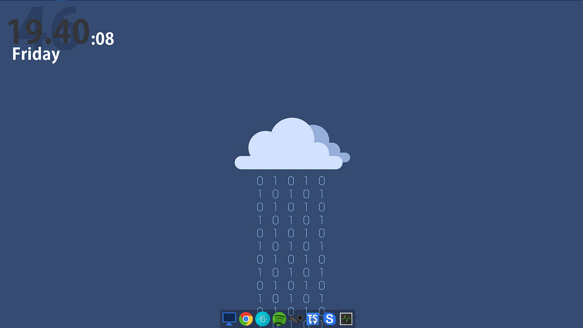
Let's take a look at my desktop for a second.
|
||
|
|
|
||
|
|
|
||
|
|
|
||
|
|
It flows. It works. It's simple. Everything I need is in that little
|
||
|
|
rainmeter dock (more info on my entire desktop [here](https://www.reddit.com/r/desktops/comments/3tha11/had_some_inspiration_minimal_once_again/)), the clock is out of the way, and I can focus on work. The Windows taskbar is hidden at the top, made the smallest size possible, so that it stays out of the way (and at the top to mimic my favorite desktop environment XFCE). I don't want it taking up the real estate on my screen, and when a notification comes in (which is fairly often), I don't want to see it blinking in the taskbar. *I know I've
|
||
|
|
received a message, and I will check it when I want.*
|
||
|
|
|
||
|
|
To summarize, Microsoft has to learn about good design. They need to
|
||
|
|
pull a 1080. I kind of liked their flatter, sharper interface, but now I
|
||
|
|
like my minimal, no frills or gimmicks setup.
|
||
|
|
|
||
|
|
At some point all this will be nullified because I'll be on Xubuntu or
|
||
|
|
some other XFCE distro, but for now these are my feelings.
|